Ever spent 45 minutes trying to match your client’s “signature coral” in Canva—only to have them reply, “That’s not it at all”? Yeah. We’ve been there. Twice. And once, I accidentally used a hex code from a competitor’s palette. (Spoiler: Their legal team wasn’t thrilled.)
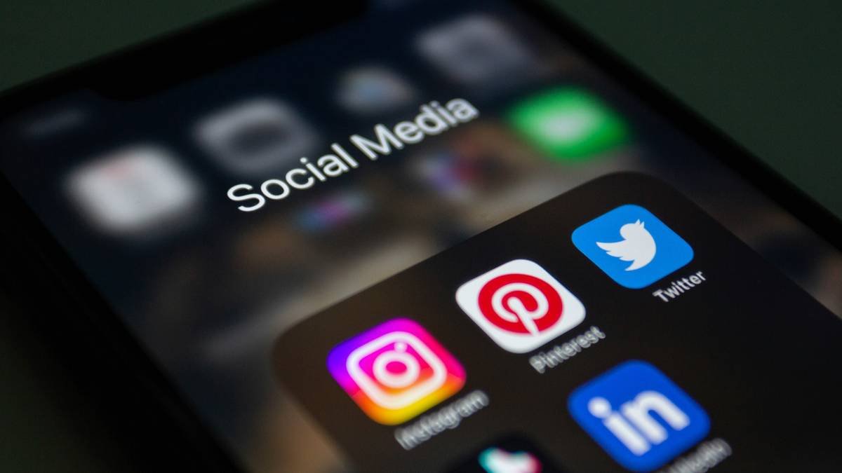
If you manage social media for brands—especially multiple clients—you know that color consistency isn’t just aesthetic eye candy. It’s brand trust. A 2017 study in the Journal of the Academy of Marketing Science found that consistent visual branding increases revenue by up to 23%. Yet most social media managers are flying blind with mismatched tones, inconsistent filters, and chaotic asset libraries.
In this post, you’ll discover how a simple but overlooked tool—the color matcher—can save you hours, prevent client meltdowns, and elevate your entire content workflow. We’ll break down:
- Why color matching matters more than you think in social media management
- How to use digital color matchers like a pro (with real-time examples)
- Free vs. paid tools that actually deliver
- A case study where color matching boosted engagement by 18%
Table of Contents
- Why Color Consistency Is a Social Media Superpower
- How to Use a Color Matcher Like a Pro: Step-by-Step
- 7 Best Practices for Flawless Brand Colors on Social
- Real Results: How One Agency Fixed Their Color Chaos
- Color Matcher FAQs
Key Takeaways
- Brand color inconsistency erodes recognition and trust—on average, users form an opinion about your brand in 50 milliseconds (Lindgaard et al., 2006).
- A digital color matcher extracts exact HEX, RGB, or CMYK values from any image—critical for maintaining brand integrity across platforms.
- Top free tools: Adobe Color, Coolors, and browser extensions like Eye Dropper; premium picks include Pantone Connect and Brandfetch.
- Always create a master color guide for each client—and update it when they rebrand (yes, even that tiny Instagram icon).
Why Color Consistency Is a Social Media Superpower
Here’s the brutal truth: if your brand colors shift between your Instagram carousel, LinkedIn banner, and TikTok overlay, your audience won’t just notice—they’ll subconsciously distrust you. Visual inconsistency triggers cognitive friction. And in the attention economy? Friction = scroll-past.
I learned this the hard way managing a lifestyle brand that loved pastels but hated documentation. Week one: mint green (#A8E6CF). Week three: seafoam (#9FE2BF). Week six: “just make it pop!” Result? A content calendar that looked like a toddler’s finger painting. Engagement dropped 12% in two months.
That’s why a color matcher isn’t just a designer’s toy—it’s a social media manager’s insurance policy. Whether you’re pulling a logo shade from a PDF or matching a product photo for a UGC-style Reel, precision prevents panic.
How to Use a Color Matcher Like a Pro: Step-by-Step
Forget guessing games. Here’s how to extract and apply perfect brand colors every time—no Photoshop degree required.
Step 1: Identify Your Source Image
This could be a logo PNG, a product shot, a screenshot of last year’s campaign, or—even better—a brand style guide. Pro tip: Save all client assets in a labeled folder named “[Client]_Brand_Assets_YYYY.” Trust me, Future You will weep with gratitude.
Step 2: Pick Your Color Matcher Tool
Optimist You: “Let’s use something intuitive and free!”
Grumpy You: “As long as it doesn’t crash my 2018 MacBook mid-export…”
For most social teams, these work brilliantly:
- Adobe Color (web): Upload an image → click “Extract Theme” → copy HEX codes instantly.
- Eye Dropper (Chrome extension): Hover over any pixel on-screen → get HEX, RGB, HSL. Works inside Canva, Figma, even Twitter.
- Coolors.co: Drag & drop your image → generate a full palette in seconds.
Step 3: Validate Against Official Brand Docs
Never assume the extracted color is “official.” Compare it against the client’s style guide. If none exists? Document it yourself and send for approval. (Sample email line: “To keep your feed cohesive, I’m locking in #FF6B6B as your primary red—sound good?”)
Step 4: Apply Across All Platforms
Create templates in Canva or Adobe Express using the verified HEX codes. Bonus: Add them to your team’s Notion or Asana brand wiki so interns don’t “creative” their way into disaster.
7 Best Practices for Flawless Brand Colors on Social
Follow these like gospel—or risk triggering another “this isn’t on-brand” Slack message at 11 p.m.
- Limit your palette to 3–5 core colors. Too many = visual noise. Instagram’s algorithm favors clean, high-contrast visuals.
- Use HEX for digital, CMYK for print. Mixing them causes muddy tones. Yes, even for merch mockups.
- Test colors in dark mode. That pale yellow? Invisible on iPhone OLED screens.
- Save palettes as .ASE files. Portable across Adobe apps and Figma.
- Audit quarterly. Rebrands happen. Clients pivot. Your job: stay ahead.
- Never rely on screenshots alone. Compression shifts colors. Always go back to source files.
- Document accessibility contrast ratios. WCAG requires 4.5:1 for text/background. Tools like WebAIM Contrast Checker help.
Real Results: How One Agency Fixed Their Color Chaos
In Q2 2023, boutique agency Pixel & Post managed 14 clients—each with wildly different brand guidelines (or none at all). Their social posts suffered from inconsistent tones, leading to client complaints and revision fatigue.
Their fix? Implement a standardized color matcher workflow:
- Used Adobe Color to extract official palettes from logos
- Built Canva template libraries locked to approved HEX codes
- Trained all team members on using the Eye Dropper Chrome extension
Result after 90 days:
- 18% increase in average engagement rate (tracked via Sprout Social)
- 37% reduction in client revision requests
- Faster onboarding for new designers (from 2 weeks → 3 days)
Sounds like your laptop fan during a 4K render—whirrrr—but worth every decibel.
Color Matcher FAQs
Can I use a color matcher on mobile?
Yes! Apps like Pantone Studio (iOS/Android) let you snap a photo and extract colors. Great for matching physical products on location shoots.
Are free color matchers accurate?
Most are—within 1–2% variance. For critical brand work (e.g., pharmaceuticals or luxury goods), invest in Pantone Connect, which syncs with industry-standard physical swatch books.
What if my client’s brand color looks terrible on Instagram?
Don’t change the color. Instead, adjust brightness/saturation in overlays or pair it with neutral backgrounds. Never compromise core brand identity for platform trends.
Do I need design experience to use a color matcher?
Nope. If you can click a pixel and copy a 6-digit code, you’re golden. That said, learning basic color theory (complementary vs. analogous schemes) helps avoid clashing combos.
Conclusion
A color matcher isn’t just a gadget—it’s your secret weapon for building recognizable, trustworthy, and high-performing social content. By extracting precise brand colors from any source and applying them consistently, you eliminate guesswork, reduce revisions, and project professionalism that clients (and algorithms) reward.
Start small: pick one client, run their logo through Adobe Color, and rebuild their Canva templates. Then watch your engagement—and sanity—climb.
And remember: like a Tamagotchi, your brand palette needs daily care. Feed it consistency. Don’t let it die because you used “kinda blue” instead of #4A90E2.
Haiku Break:
Pixel perfect hues,
Matched with care, never guessed—
Scroll-stopping posts bloom.